PINJA
Editorial Design
A bold editorial report that turns research on inclusive marketing into something people actually want to read: loud typography, a fearless palette and data visualisation that carries the argument.
The idea
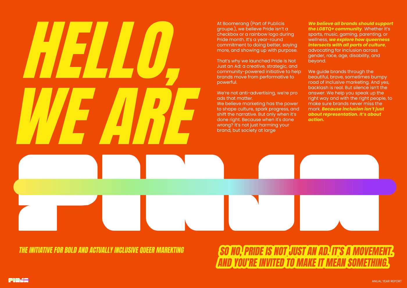
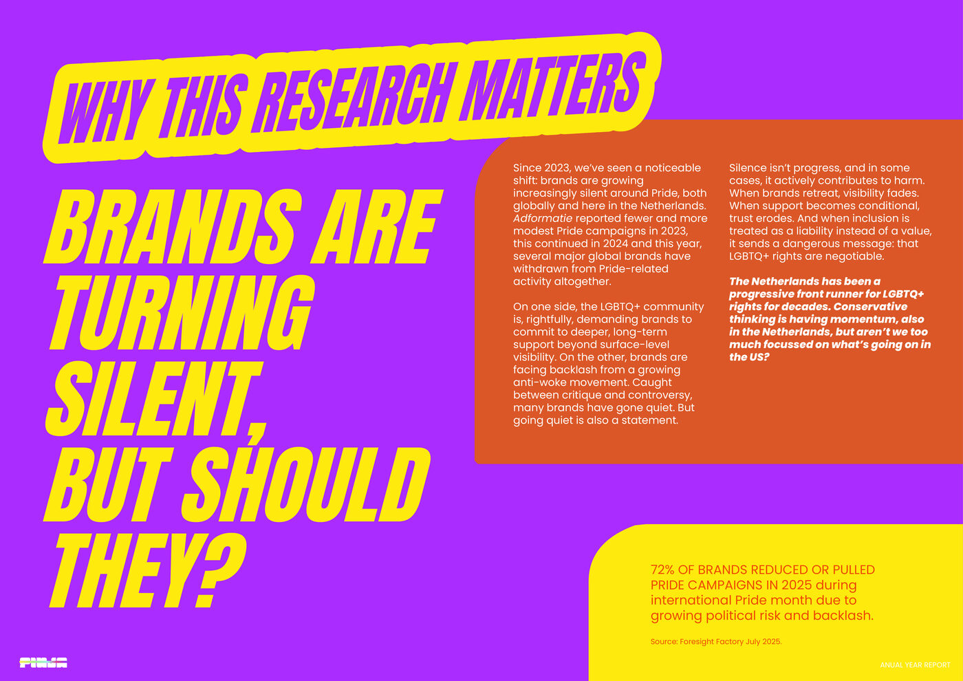
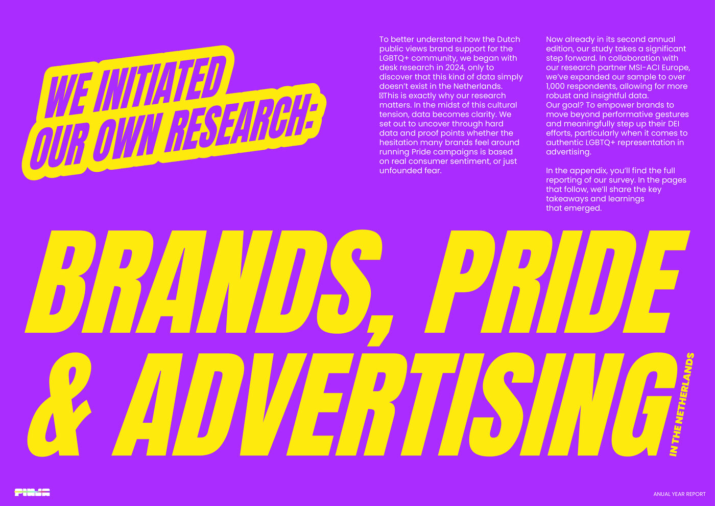
The content is opinionated, so the design had to be too. I used display type as the lead voice: oversized, expressive headlines set against a high-energy palette of orange, purple and acid yellow, while a disciplined grid keeps the long-form copy calm and readable underneath.
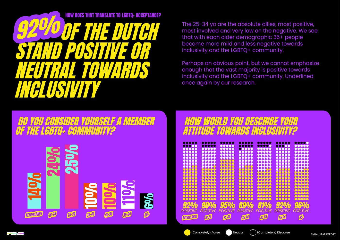
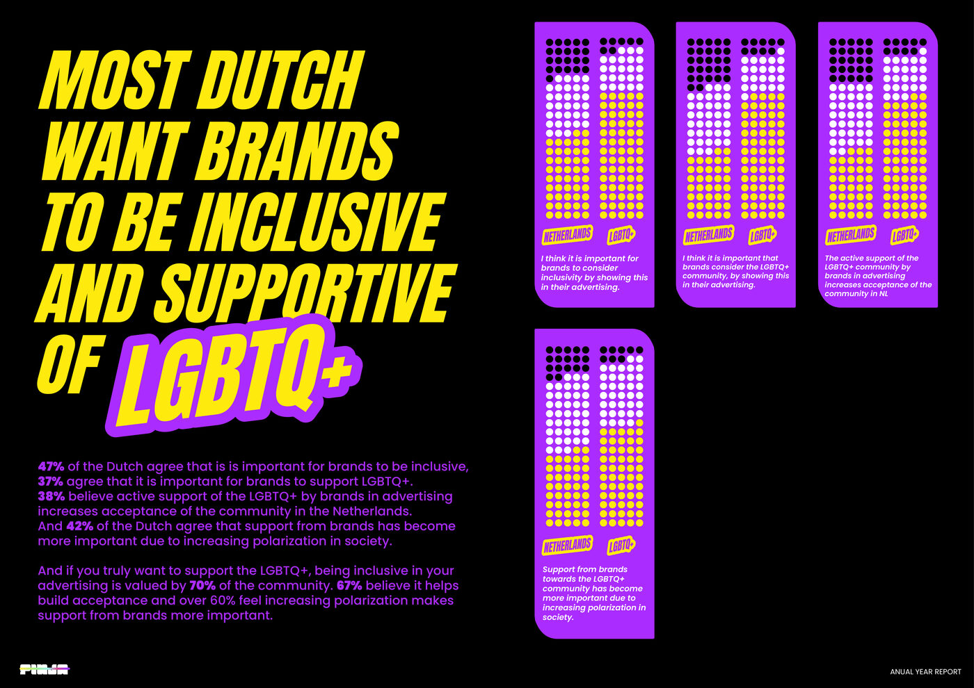
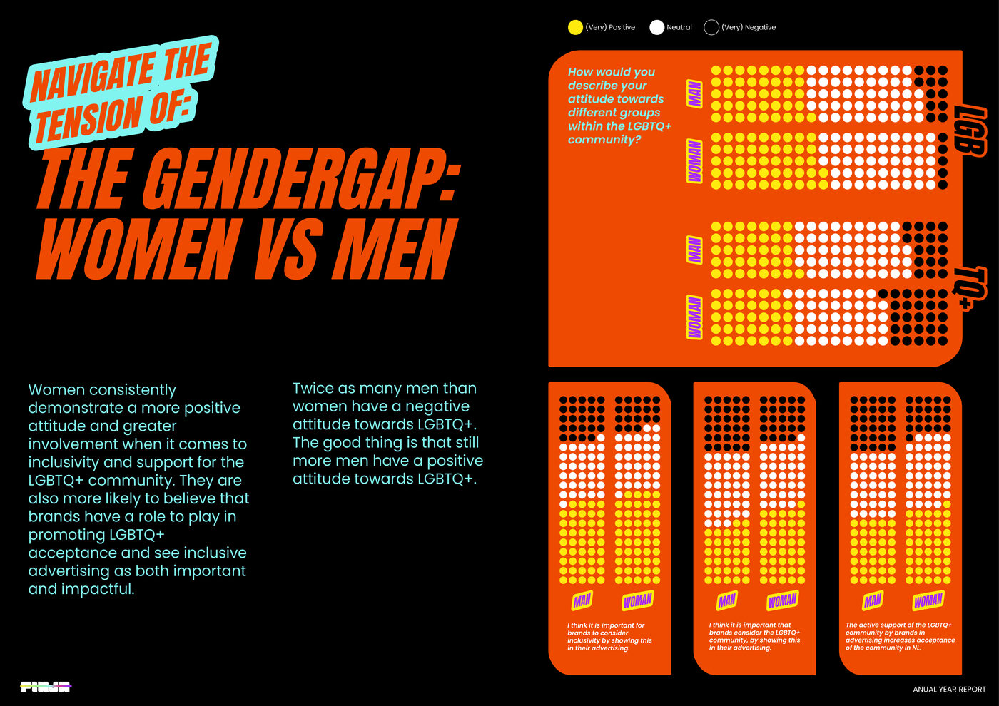
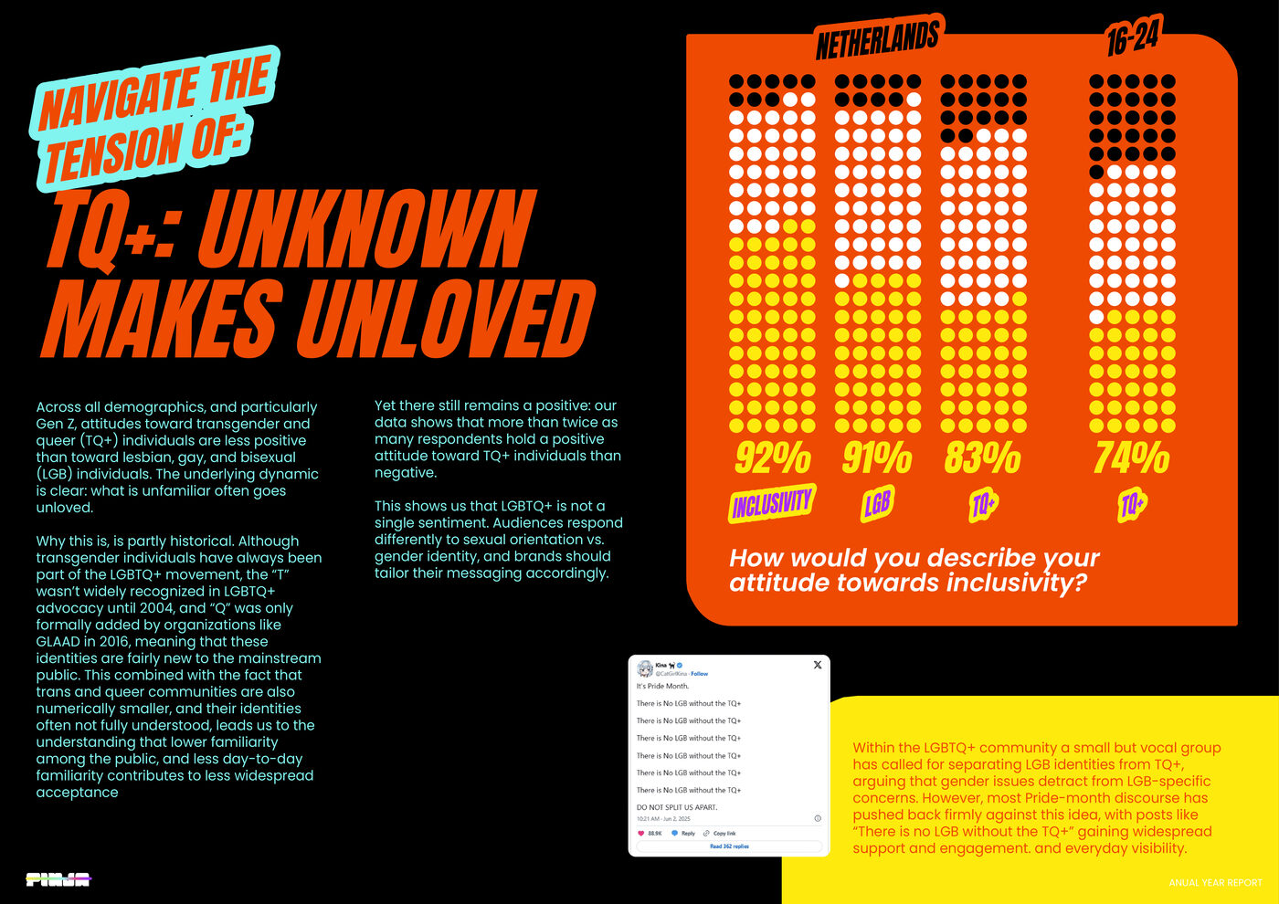
The real test of an editorial system is data. Charts and infographics here aren't bolted on; they're styled into the same world as the headlines, so a statistic lands with the same punch as a pull quote.
Type that argues. Data that lands. A layout system that holds 26 pages together.
Outcome
A cohesive editorial system that proves design can make a dense, research-heavy subject genuinely compelling, balancing expressive art direction with the structure and discipline that long-form reading demands.