DevBean:
Identity System
A complete identity system and website for DevBean, a start-up that helps creatives reach their goals online — from e-commerce websites to brand identities. Built step by step, with the client aligned at every stage of the process.
The brief
DevBean is a start-up I worked for as a designer. Their focus is helping other creatives reach their goals through strategy in the online world, from building e-commerce websites to brand identities. The challenge: create an identity with a young, professional look that stands out from the standard, tied to a website that shows what the brand stands for without overcomplicating it.
The result is an identity system and a website that show how DevBean works through their portfolio pieces and process — building the trust that turns a visitor into a client.
Every step in the process creates an anchor point for the next one. That way I make sure the client and I are aligned before the design moves on — from first words to working prototype.
It’s important to define a brand in words before designing it — the beginning of its foundation. Through the brand discovery you slowly build an idea of the voice, feel and look of the brand, as a rough indication where nothing is set in stone yet.
With all the words on the table, we highlighted the two that define the brand most, and these became the base for the first design explorations. The conclusion: DevBean should be visualised with a vibrant tech look, kept minimal to maintain a simple yet effective aesthetic.
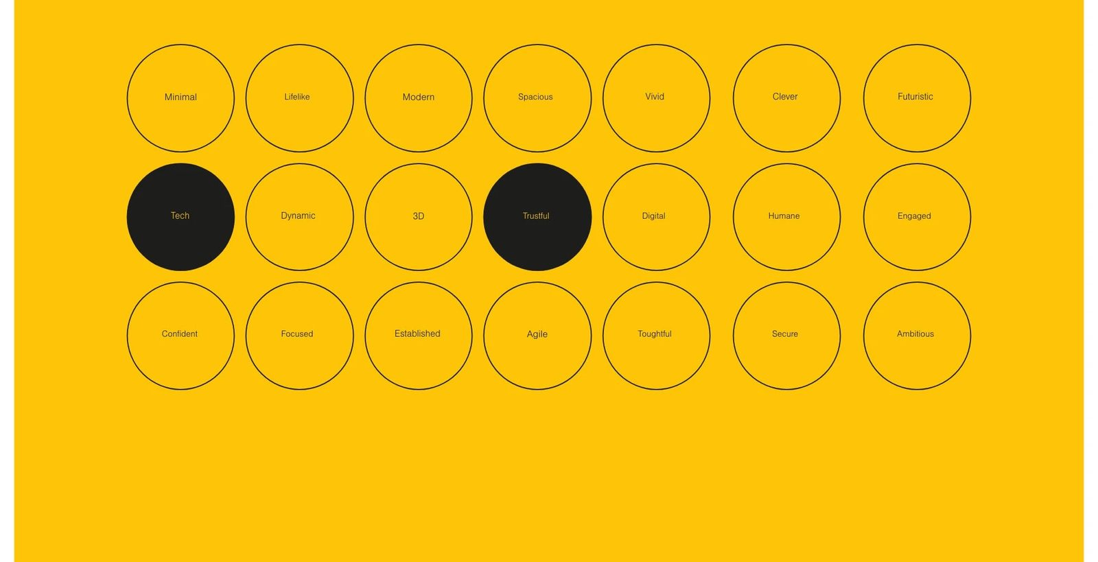
Each step is an anchor point for the next: the client agrees on the direction before a single artwork is made.
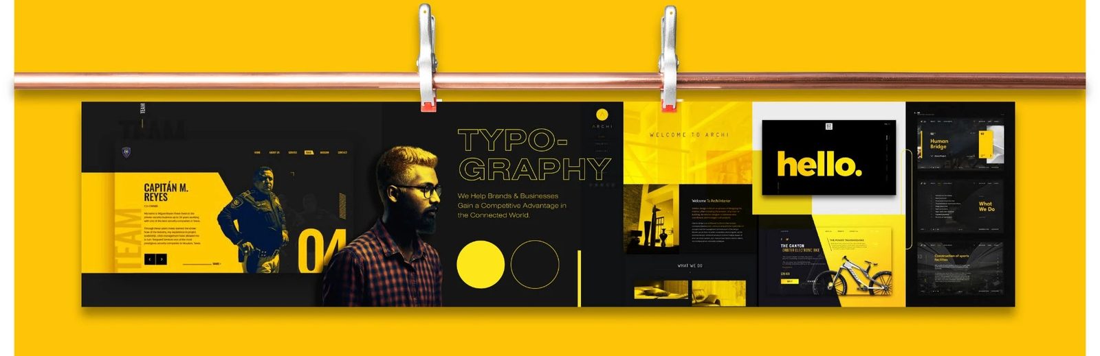
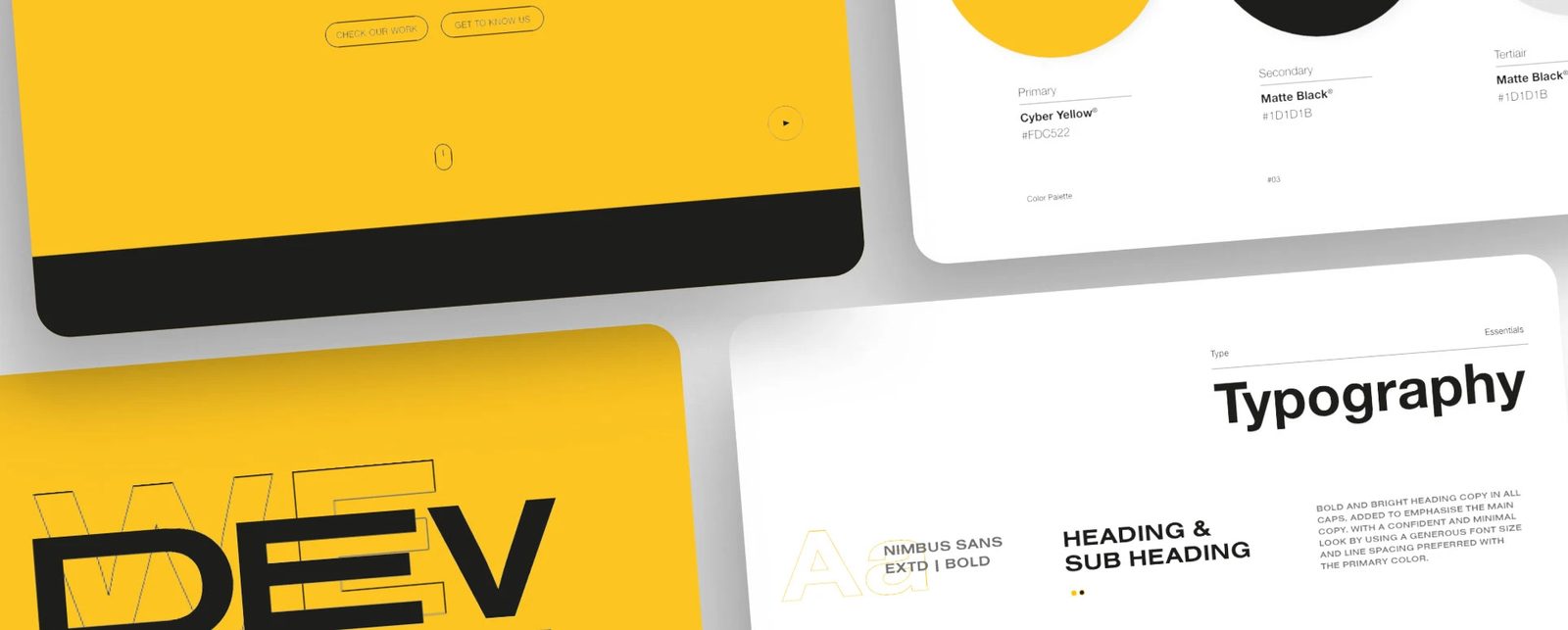
After the brand discovery I created a stylescape to translate those words into a visualisation. It brings together colour, typeface, image, texture and illustration references, giving a precise direction for the designs to come — and a clear moment to agree on that direction together.
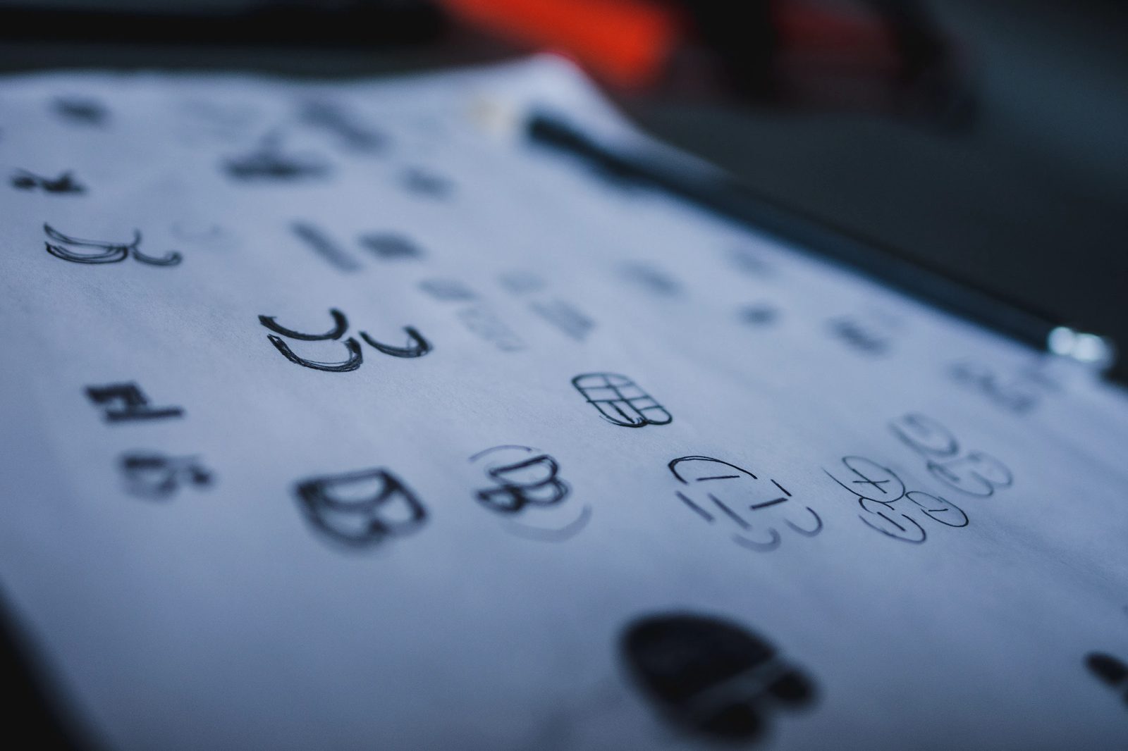
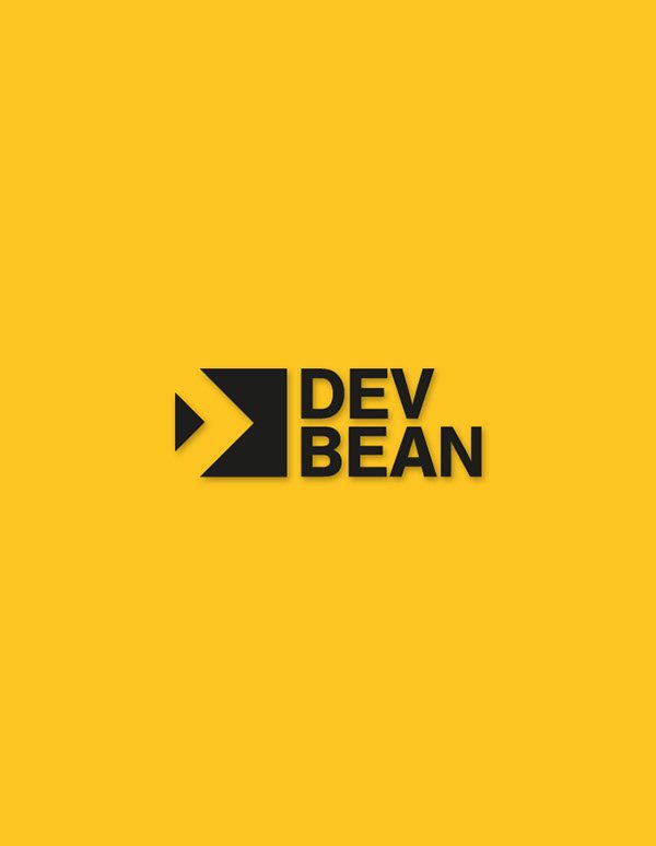
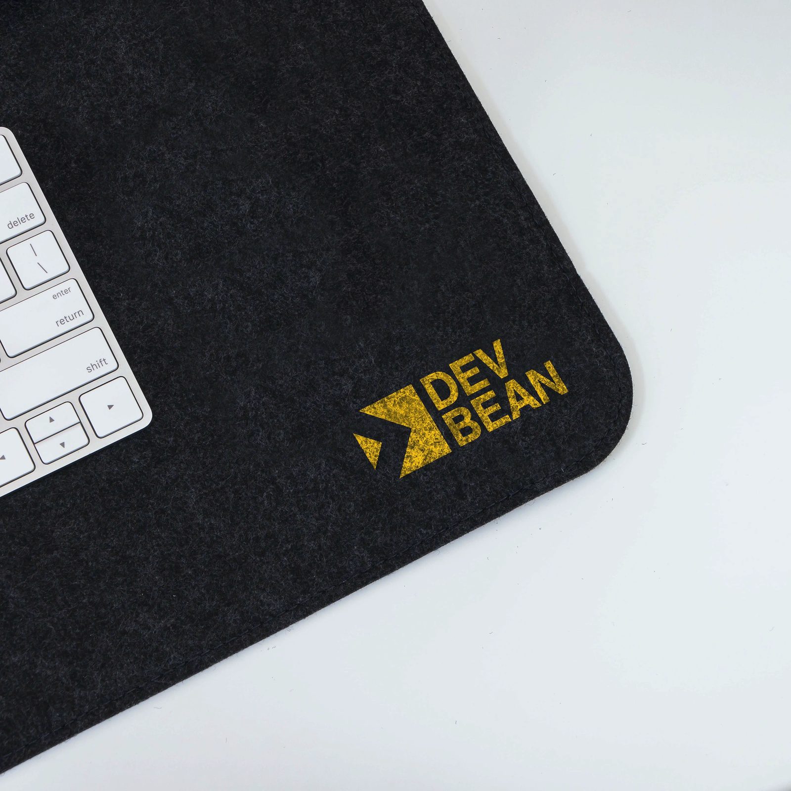
With the stylescape approved I started building the visual identity, sketching logo ideas on paper first. That led to the idea of a square: the building block DevBean is for other companies. The negative space inside the square forms the silhouette of a code symbol — the nod to web development the client wanted incorporated in the logo.
The word mark and icon also work separately, so the logo is applicable at any scale. To bring the mark to life, I animated the word mark to make it more dynamic.

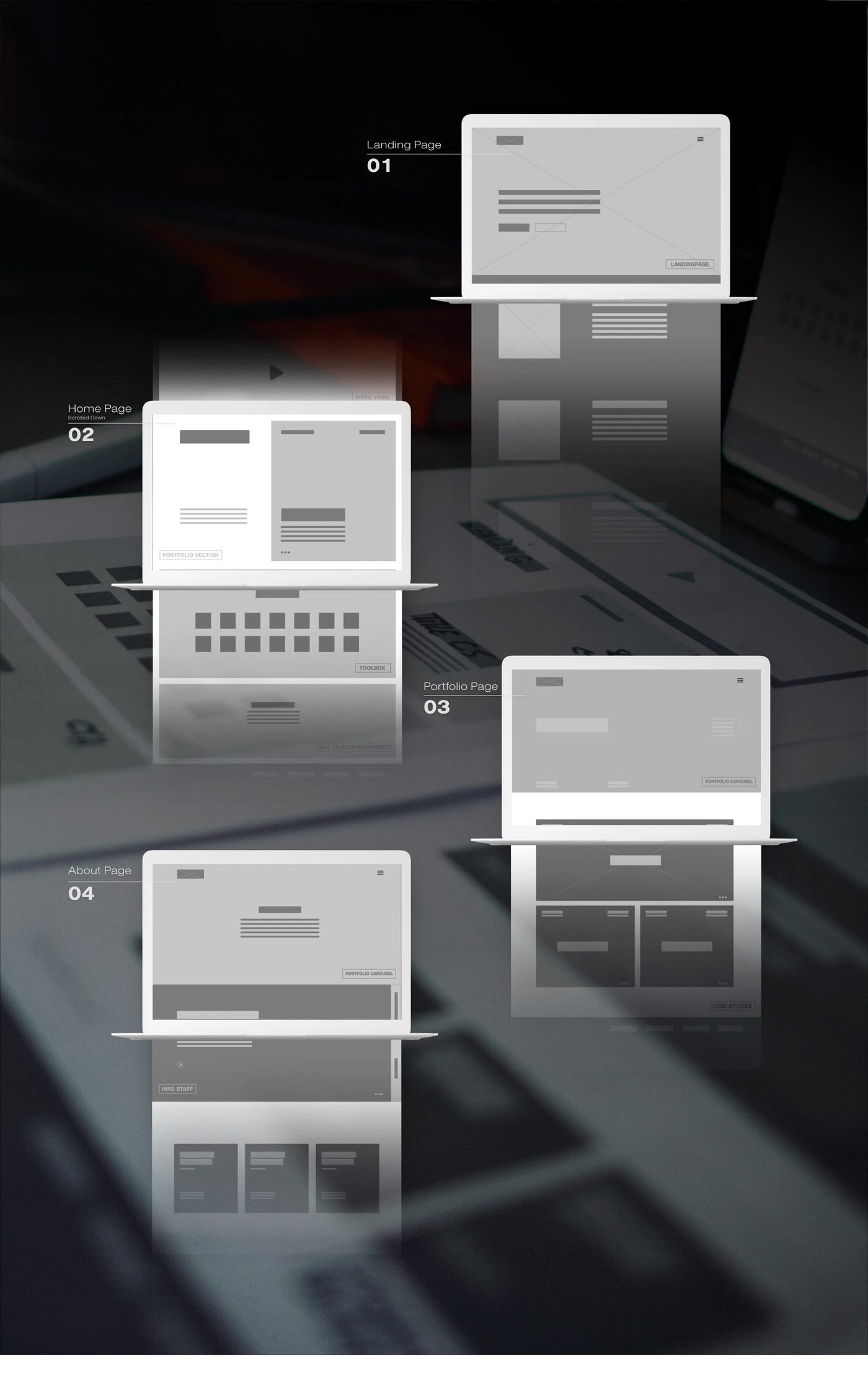
With the identity system set, the website came next — starting with an inventory list that prioritises all the content and pages the site needs. Knowing what every page had to display, I moved on to wireframes: a rough structure and flow for the website, like the blueprint for a building.

Using the newly made identity system on top of the wireframes, I designed the final prototype: every page with its essential content, along with the details — animations and mouse-hover states included.
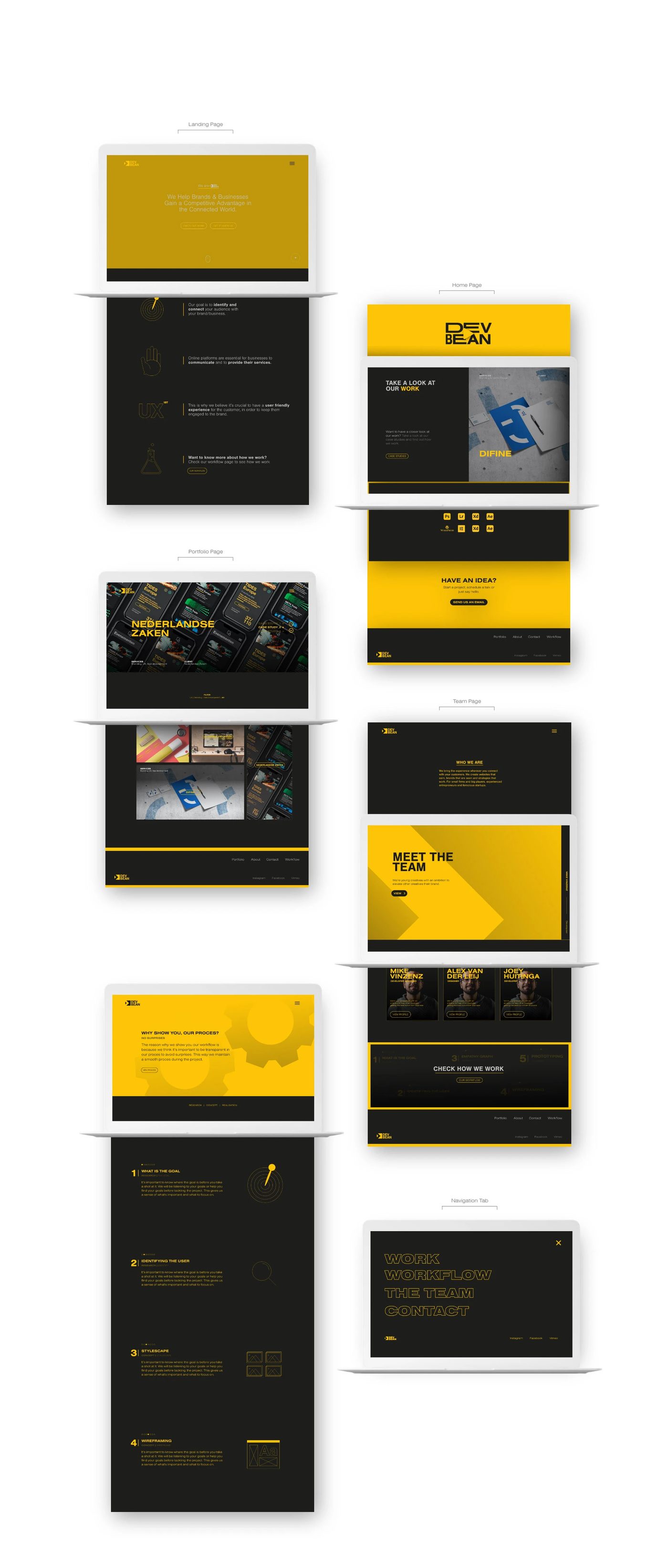
Outcome
A professional identity system that matches DevBean’s vision of helping other creatives through strategy, and a website that supports it by creating trust through their work. Just as important, this project shows how I keep a client on board at every step, from the first words to the final prototype.